You walk the streets of your small town. You look around in shop windows, and you see the same store owners. The same reliable patrons. The same smiles. But something is off. Something is wrong. Some kind of vibrancy has been replaced. What lingers here is, somehow, no longer human. Something alien has emerged instead, seeping its way into these businesses and sapping them of their vitality.
No, it’s not Invasion of the Body Snatchers. It’s generative artificial intelligence, and it’s produced a crisis that I can only call “Small Town Slop.”
What do I mean by this? “Slop” was Merriam-Webster’s word of the year in 2025, which they defined as “digital content of low quality that is produced usually in quantity by means of artificial intelligence.” It’s a broad category that includes propaganda, absurd videos created to try and drive attention metrics on social media, entire books (and shows) created with LLMs, and advertising generated with AI. In their write-up on “slop,” Merriam-Webster notes that the word was originally used to mean “soft mud” in the 1700s, “food waste” in the 1880s, and then eventually “rubbish” or something “of little or no value.” To call AI-produced products “slop” is to not only note their generally poor quality but also to assert that it has no value in and of itself. Several weeks ago, I wrote about how some uses of AI are like “Hitting Yourself in the Head with a Hammer,” and this post explores yet another way the ostensible convenience of AI use actually risks communicating the opposite of its intent.
“Small Town Slop,” as I’m provisionally defining it (because I haven’t seen this exact phrase show up anywhere, but let me know if you’ve seen it somewhere), refers to an aesthetic wherein small businesses and small towns are turning to artificial intelligence to create fliers for their storefronts and/or their social media pages instead of hiring a graphic designer or photographer to do this work for them. There are many things Small Town Slop does, some of which I’ll talk about throughout this post, but at its heart, it subverts the ethos of supporting small businesses while simultaneously stripping any aesthetically distinct creativity from businesses’ identities. When small business owners use ChatGPT, Stable Diffusion, Canva AI, Gemini, or other services to generate artistic and promotional material, the outputs all end up smushing together into a bland, borderline repulsive design.
Before going on, let me give you just the tiniest bit of background on my town of Central, SC. Central is a small town of just over 5,000 residents. We are a neighbor to Clemson, SC (home of Clemson University and itself a small town of less than 20,000. There are more University students than there are residents of the city of Clemson, even accounting for some percentage of overlap). Our “downtown” is a classic Main Street strip of shops and restaurants with several additional blocks of stores and coffee around that strip, and a local market on the far end. It’s very small. But I adore downtown Central. We were built as a rail town and were incorporated in 1875. The town was literally built around the railroad, as the rail line bisects the downtown area. Central is located in the northwestern Upstate of South Carolina; the name refers to being the halfway point between Atlanta and Charlotte (if you’re traveling by rail). When the Southern Railroad moved their repair shops from Central to Greenville in the 1890s, it caused economic downturn for the town. I mention this because Central’s history is fundamentally tied to infrastructures of transit and communication, and changes in technologies have been part of the town’s economic possibilities (and while there’s more to say here, it’s not really the focus of this post, so I’ll just let that detour float into the air for now). I also mention it because the “small-ness” of Central is important for thinking about the role Small Town Slop plays in these kinds of places.
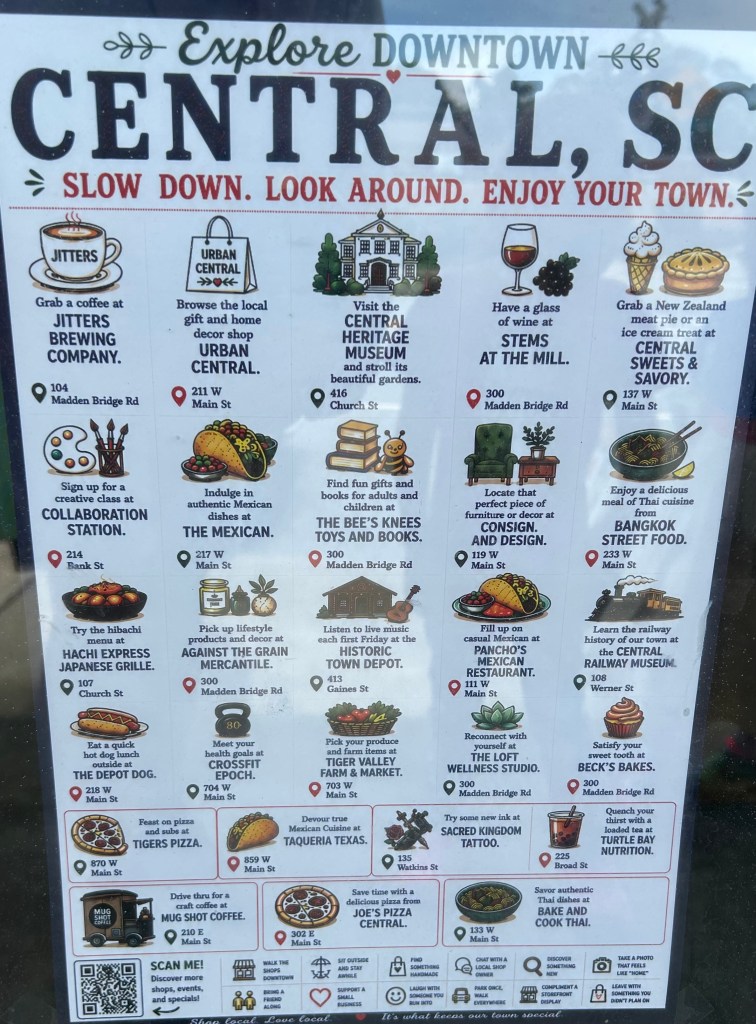
In mid-June, I first noticed the same AI-generated fliers appearing everywhere (the image that serves as the header for this post). “Explore Downtown Central, SC. Slow down. Look around. Enjoy your town.” Okay, fair enough, but the flier goes on to list 23 different businesses, each with its own little image with the name of the business and something about it. They also include the addresses for the businesses, and then on the bottom there are twelve different slogans smushed together that include that basic “Support a Small Business,” as well as odder suggestions like “Compliment a Storefront Display.” The image is, in a word, cluttered. At a passing glance, it just seems a deluge of information about things to do in Central, maybe something that would be better as a handout than taped to a window, but once you lean in and really look at the image strange things start to stick out: Nonsensical ingredients on a taco, pizzas that are missing part of their crusts, a distorted train, odd clusters at the end of paintbrushes, the word “Coffee” smushed together and askew. These artifacts give away the image as AI generated. The writing is simply odd, and does not reflect how a trained copy writer and designer would create such an image. The phrases used to describe the businesses have constantly dangling prepositions (look at how many lines end with “at”) or adding punctuation in ways that feel odd for a flier (note how every business name has a period after it).
It’s unclear where the image comes from (ChatGPT, Canva’s AI integration, Gemini, etc.), who created it (one of the businesses, the town itself, a third party hired to do business promotion, etc.), and I’m less interested in “getting to the bottom” of this particular image than I am of pointing to it as symptomatic of a larger problem. I’m seeing more images and organizations create these kinds of images, both in Central as well as other nearby towns, and I’m seeing more of them online. You’ve probably seen them too. Maybe you also feel like they look too cluttered and weird, sort of alienating in the way they communicate information. Like a facsimile of an advertisement. Restaurants “advertising” their menu items with AI-generated images of food that looks like something that could send you to the hospital. Events being advertised with apples, leaves, and pumpkins stuffed into every inch of the frame but without key information like location and time. Earlier this year, an “AI-assisted” poster won the Ohio State Fair art contest, prompting backlash from the artistic community about the merits of giving what is basically a computer output an award.
What I care about is what these images are conveying within a broader set of interlocking crises around the entanglements of generative AI and everyday life. In the Central, SC flier, the bottom of the image (because there wasn’t already enough text on this dang thing) has three sentences: “Shop local. Love local. It’s what keeps our town special.”
In 2010, “Small Business Saturday” and “Small Business Sunday” each emerged as ways to focus attention on spending money with local businesses. This was in the aftershocks of the 2008 economic recession, when many businesses were floundering — and larger corporations were consolidating power as consumer spending waned. The focus on driving foot traffic to brick-and-mortar stores responded to a specific crisis existing in a specific political economic conjuncture. Even though, in the U.S., Small Business Saturday is attributed to the credit card behemoth American Express (who would, of course, stand to benefit from any increase in consumer spending during a recession), its ethos nonetheless is focused on an idea of economic relations that values keeping dollars circulating within communities rather than traveling out to corporate powers.
To return to the provisional definition I offered earlier, how does Small Town Slop subvert the ethos of supporting small businesses? In a 2025 column for The Ringer by Brian Phillips on “The Slopification of Everything,” Phillips argues “Slop has contempt for creators and audiences” and “the idea of integrity is antithetical to slop.” If you perform some searches for “small businesses and ai advertising,” you’ll see a number of people defending the use of these graphics, often through AI-created graphics or AI-generated posts of their own (here’s looking at you, LinkedIn, often a wasteland of AI-generated engagement-bait). There are two lines you’ll often hear: the first is that these businesses don’t have the money to hire a graphic designer ; the second is that AI is merely lowering the barrier to entry in ways similar to clip art and stock photos.
Both of these statements may be true to a point (some businesses likely don’t have the money to hire a dedicated graphic designer, and AI images are easier to create than taking high-quality photographs or purchasing stock photos), but they overlook a couple key things. First, depending on your perspective, AI art is theft. Training AI models depends on providing them as many images as possible so they can learn photographic convention and how to generate images that are basically standardized around the most likely combination of pixels to create images based on the prompts provided. Molly Crabapple, writing in The Guardian, calls it “the greatest art heist in history.” So if the images are soulless and the pizza looks weird, it’s because it is a computational understanding based of what a pizza looks like based on some arbitrarily large number of images of pizza on which the model has been trained to build an understanding of the visual conventions of this item which is coded and tagged as ‘pizza.’ The image generator is regurgitating its ideas about what this looks like, making copies of copies that are just ever so slightly degraded.
To make a slightly awkward analogy, think about the arguments that have been made about how buying from Amazon is contributing to the exploitation of small businesses. Investigations and research have demonstrated how Amazon has created knockoffs of products to prioritize in search returns while acting as an e-commerce monopoly. For years now, we have been told that it is harmful to buy from Amazon (no argument there) and we should instead focus on supporting smaller businesses because it is the ethically right thing to do. This is an economic as well as a cultural argument, one that was meant to provide some means of off-setting the seemingly endless entrenchment of corporate enshittification into daily commerce while rebuilding “Main Streets” like the one in Central, SC.
To be fair (I guess?), any claims of “theft” are more ethical than legal. In Getty Images v. Stable Diffusion, the English High Court ruled that images created in Stable Diffusion “contain no reproductions of relevant works, i.e., there are no copies in the model.” Even though Getty Images claimed Stable Diffusion had committed copyright infringement “based on web scraping and on model scraping and on allegedly infringing outputs,” the Court disagreed that Stable Diffusion’s outputs constituted an infringement. Similar judgments have been made for publishing, where authors have unsuccessfully for copyright infringement of their works being used to train LLMs. At least for the time being, AI use of copyrighted works for training seems to fall into something like fair use because it is not directly reproducing those works for profit. However, a recent federal appeals decision maintained a ruling in favor of Thomas Reuters that found an AI startup had violated copyright by using their Reuters’ content without permission or compensation. Whether you agree with this or not probably informs where you stand on the use of AI imagery in small town slop. Much like how some might make some excuses for the convenient and cheap infrastructure Amazon provides, so too might some excuse AI imagery generation as a sort of ethical gray area that helps small businesses get ahead and gain visibility.
But is this visibility even…good? This gets to the second part of my provisional definition, that the aesthetics of small town slop become smushed together into a repulsive same-ness. If you know how to spot AI images, you can note that they often use the same fonts, similar phrasing in background images, the same design for things like smiley faces and hearts, and they crowd images with as much detail as possible (consider how, in some advertisements, the entire border gets covered with repeating images like apples or leaves). Although AI does lower a barrier for business owners to create images, these images actually aren’t personalized beyond the text: they are amalgamations that are standardized to how the image generator understands the requests it receives to produce these images. Just look at how many of these images have not only the same fonts and templates, but the same-looking characters (either cartoon or “photorealistic” people), same weird characteristics in food or drinks, or same way of representing spaces. Hito Steyerl has called these “mean images,” in that they are generated towards averages, towards conventions. While AI image models may be “creative” in the literal sense of having the function to create, they lack the connotative understanding of the word’s link to “imagination,” which understands the formation and manipulation of images as based on the senses
This is creativity reduced to a mathematical theory of communication, or to mix my theories, art in the age of its generative production. Critics of mass culture like Theodor Adorno and Max Horkheimer railed, in the 1940s, against how the conditions of industrially producing things like film and radio led to a culture of aesthetic ‘sameness,’ where human producers converged on similar aesthetics and storylines to maximize profit without challenging audiences. Generative AI harbors a promise akin to something like ‘create whatever you want,’ but its outputs also slink toward a strange, soulless sameness of amber hues, rounded faces, and freakish amounts of detail in food. Again, it’s an Invasion of the Body Snatchers when it comes to creative expression. Maybe I spend too much time looking at these images, but they do often feel like aliens who are trying to study and then reproduce what they think humans want to see or how humans look and act. Or, to quote 2026’s Backrooms, “Imagine describing a dog to someone who’s never seen a dog and asking them to draw it” (there are a lot connections to made between the Backrooms and diffusion models).
Suggestions that AI advertisements are just a new form of stock images or clip art evacuate the fact that stock images were produced by human labor, sometimes with human actors. They have what visual theorists might call an indexical trace (a connection back to a staged event in front of a camera) that, even if it’s kind of corny and silly, still reflects the labor of the photographer. Paying for the right to use that image is a way of compensating that photographer for their labor. If businesses feel, understandably, that they cannot hire a full-time designer, they might consider ad hoc and freelance work to produce artistic assets that can serve as the basis or templates of future advertising. The surge in AI image production only contributes to job precarity and job loss for graphic designers and related creative workers. A recent examination suggests the U.S. has lost over 200,000 jobs in creative industries over the last four years, with approximately 50,000 of those losses in the last year. Graphic design jobs are predicted to be one of the fastest declining areas of employment by 2030, according to a World Economic Forum analysis. Major brands like Heinz and Coca Cola have already demonstrated a willingness to create entire ad campaigns with artificial intelligence tools. If we “Love local,” then why are we willing to sacrifice supporting local creative artists in the name of faster outputs?
This, to me, is a core tension we are currently navigating amidst all the many ways generative AI’s proliferation alters extant configurations of economy, society, and culture. When people claim they are using these technologies as tools, those tools are always exerting some form of power. They may be ostensibly beneficial to the user, but someone else gets hurt in the collateral damage. When people talk about AI use and job loss, this is what they mean: refusing to support (and by support, I mean pay) local designers for their labor in the name of making a quick, dirty, and ugly image. It does not communicate anything “Special,” but rather makes small towns look like anywhere-and-everywhere-and-nowhere simultaneously.
When people are asked to “Shop local” and “Support local,” we might do well to ask, for an increasing number of local businesses and communities, why that support does not extend to local artists or designers. Why should we support businesses who choose to outsource their labor to extractive companies instead of investing back into local artists? Storefronts communicate not only what is for sale, but also a company’s practices and values. They tell us what grade restaurants received on their last inspection. They can signal whether a business is LGBTQ+ friendly, or if they are politically active (should they choose to, say, include a political candidate’s sign outside their store). They tell us about upcoming events, daily specials, and serve as a point of first-contact for foot traffic. Small Town Slop harbors its own set of implicit values about where stores invest their time and resources.