Invasion of the Copy Snatchers: Small Town Slop and the Limits of ‘Support Local’

You walk the streets of your small town. You look around in shop windows, and you see the same store owners. The same reliable patrons. The same smiles. But something is off. Something is wrong. Some kind of vibrancy has been replaced. What lingers here is, somehow, no longer human. Something alien has emerged instead, seeping its way into these businesses and sapping them of their vitality.

No, it’s not Invasion of the Body Snatchers. It’s generative artificial intelligence, and it’s produced a crisis that I can only call “Small Town Slop.”

What do I mean by this? “Slop” was Merriam-Webster’s word of the year in 2025, which they defined as “digital content of low quality that is produced usually in quantity by means of artificial intelligence.” It’s a broad category that includes propaganda, absurd videos created to try and drive attention metrics on social media, entire books (and shows) created with LLMs, and advertising generated with AI. In their write-up on “slop,” Merriam-Webster notes that the word was originally used to mean “soft mud” in the 1700s, “food waste” in the 1880s, and then eventually “rubbish” or something “of little or no value.” To call AI-produced products “slop” is to not only note their generally poor quality but also to assert that it has no value in and of itself. Several weeks ago, I wrote about how some uses of AI are like “Hitting Yourself in the Head with a Hammer,” and this post explores yet another way the ostensible convenience of AI use actually risks communicating the opposite of its intent.

“Small Town Slop,” as I’m provisionally defining it (because I haven’t seen this exact phrase show up anywhere, but let me know if you’ve seen it somewhere), refers to an aesthetic wherein small businesses and small towns are turning to artificial intelligence to create fliers for their storefronts and/or their social media pages instead of hiring a graphic designer or photographer to do this work for them. There are many things Small Town Slop does, some of which I’ll talk about throughout this post, but at its heart, it subverts the ethos of supporting small businesses while simultaneously stripping any aesthetically distinct creativity from businesses’ identities. When small business owners use ChatGPT, Stable Diffusion, Canva AI, Gemini, or other services to generate artistic and promotional material, the outputs all end up smushing together into a bland, borderline repulsive design.

Before going on, let me give you just the tiniest bit of background on my town of Central, SC. Central is a small town of just over 5,000 residents. We are a neighbor to Clemson, SC (home of Clemson University and itself a small town of less than 20,000. There are more University students than there are residents of the city of Clemson, even accounting for some percentage of overlap). Our “downtown” is a classic Main Street strip of shops and restaurants with several additional blocks of stores and coffee around that strip, and a local market on the far end. It’s very small. But I adore downtown Central. We were built as a rail town and were incorporated in 1875. The town was literally built around the railroad, as the rail line bisects the downtown area. Central is located in the northwestern Upstate of South Carolina; the name refers to being the halfway point between Atlanta and Charlotte (if you’re traveling by rail). When the Southern Railroad moved their repair shops from Central to Greenville in the 1890s, it caused economic downturn for the town. I mention this because Central’s history is fundamentally tied to infrastructures of transit and communication, and changes in technologies have been part of the town’s economic possibilities (and while there’s more to say here, it’s not really the focus of this post, so I’ll just let that detour float into the air for now). I also mention it because the “small-ness” of Central is important for thinking about the role Small Town Slop plays in these kinds of places.

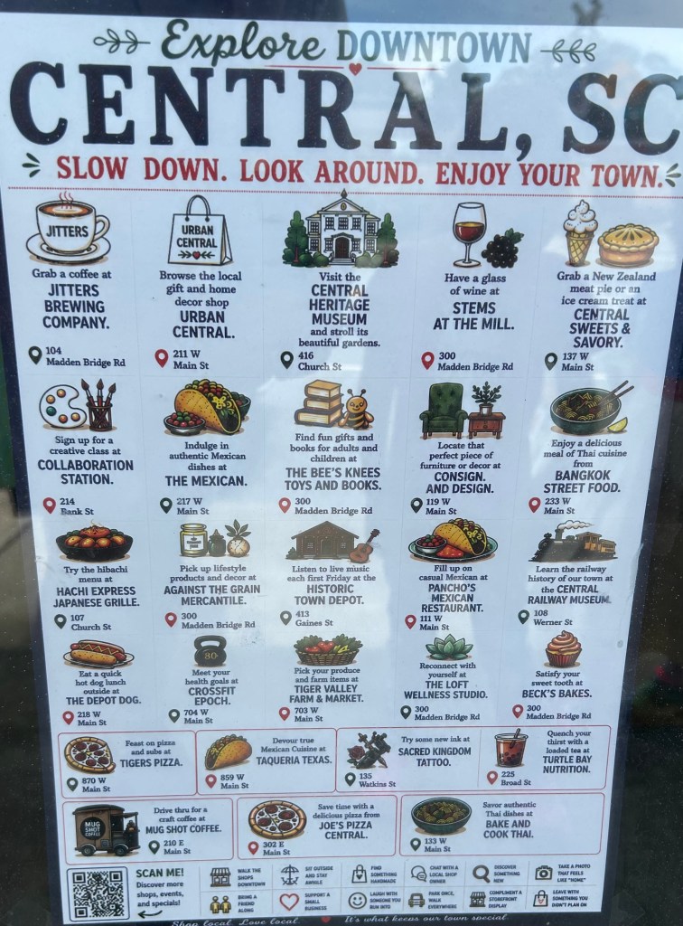
In mid-June, I first noticed the same AI-generated fliers appearing everywhere (the image that serves as the header for this post). “Explore Downtown Central, SC. Slow down. Look around. Enjoy your town.” Okay, fair enough, but the flier goes on to list 23 different businesses, each with its own little image with the name of the business and something about it. They also include the addresses for the businesses, and then on the bottom there are twelve different slogans smushed together that include that basic “Support a Small Business,” as well as odder suggestions like “Compliment a Storefront Display.” The image is, in a word, cluttered. At a passing glance, it just seems a deluge of information about things to do in Central, maybe something that would be better as a handout than taped to a window, but once you lean in and really look at the image strange things start to stick out: Nonsensical ingredients on a taco, pizzas that are missing part of their crusts, a distorted train, odd clusters at the end of paintbrushes, the word “Coffee” smushed together and askew. These artifacts give away the image as AI generated. The writing is simply odd, and does not reflect how a trained copy writer and designer would create such an image. The phrases used to describe the businesses have constantly dangling prepositions (look at how many lines end with “at”) or adding punctuation in ways that feel odd for a flier (note how every business name has a period after it).

 It’s unclear where the image comes from (ChatGPT, Canva’s AI integration, Gemini, etc.), who created it (one of the businesses, the town itself, a third party hired to do business promotion, etc.), and I’m less interested in “getting to the bottom” of this particular image than I am of pointing to it as symptomatic of a larger problem. I’m seeing more images and organizations create these kinds of images, both in Central as well as other nearby towns, and I’m seeing more of them online. You’ve probably seen them too. Maybe you also feel like they look too cluttered and weird, sort of alienating in the way they communicate information. Like a facsimile of an advertisement. Restaurants “advertising” their menu items with AI-generated images of food that looks like something that could send you to the hospital. Events being advertised with apples, leaves, and pumpkins stuffed into every inch of the frame but without key information like location and time.  Earlier this year, an “AI-assisted” poster won the Ohio State Fair art contest, prompting backlash from the artistic community about the merits of giving what is basically a computer output an award.

What I care about is what these images are conveying within a broader set of interlocking crises around the entanglements of generative AI and everyday life. In the Central, SC flier, the bottom of the image (because there wasn’t already enough text on this dang thing) has three sentences: “Shop local. Love local. It’s what keeps our town special.”

In 2010, “Small Business Saturday” and “Small Business Sunday” each emerged as ways to focus attention on spending money with local businesses. This was in the aftershocks of the 2008 economic recession, when many businesses were floundering — and larger corporations were consolidating power as consumer spending waned. The focus on driving foot traffic to brick-and-mortar stores responded to a specific crisis existing in a specific political economic conjuncture. Even though, in the U.S., Small Business Saturday is attributed to the credit card behemoth American Express (who would, of course, stand to benefit from any increase in consumer spending during a recession), its ethos nonetheless is focused on an idea of economic relations that values keeping dollars circulating within communities rather than traveling out to corporate powers.

To return to the provisional definition I offered earlier, how does Small Town Slop subvert the ethos of supporting small businesses? In a 2025 column for The Ringer by Brian Phillips on “The Slopification of Everything,” Phillips argues “Slop has contempt for creators and audiences” and “the idea of integrity is antithetical to slop.” If you perform some searches for “small businesses and ai advertising,” you’ll see a number of people defending the use of these graphics, often through AI-created graphics or AI-generated posts of their own (here’s looking at you, LinkedIn, often a wasteland of AI-generated engagement-bait). There are two lines you’ll often hear: the first is that these businesses don’t have the money to hire a graphic designer ; the second is that AI is merely lowering the barrier to entry in ways similar to clip art and stock photos.

Both of these statements may be true to a point (some businesses likely don’t have the money to hire a dedicated graphic designer, and AI images are easier to create than taking high-quality photographs or purchasing stock photos), but they overlook a couple key things. First, depending on your perspective, AI art is theft. Training AI models depends on providing them as many images as possible so they can learn photographic convention and how to generate images that are basically standardized around the most likely combination of pixels to create images based on the prompts provided. Molly Crabapple, writing in The Guardian, calls it “the greatest art heist in history.” So if the images are soulless and the pizza looks weird, it’s because it is a computational understanding based of what a pizza looks like based on some arbitrarily large number of images of pizza on which the model has been trained to build an understanding of the visual conventions of this item which is coded and tagged as ‘pizza.’ The image generator is regurgitating its ideas about what this looks like, making copies of copies that are just ever so slightly degraded. 

To make a slightly awkward analogy, think about the arguments that have been made about how buying from Amazon is contributing to the exploitation of small businesses. Investigations and research have demonstrated how Amazon has created knockoffs of products to prioritize in search returns while acting as an e-commerce monopoly. For years now, we have been told that it is harmful to buy from Amazon (no argument there) and we should instead focus on supporting smaller businesses because it is the ethically right thing to do. This is an economic as well as a cultural argument, one that was meant to provide some means of off-setting the seemingly endless entrenchment of corporate enshittification into daily commerce while rebuilding “Main Streets” like the one in Central, SC.

To be fair (I guess?), any claims of “theft” are more ethical than legal. In Getty Images v. Stable Diffusion, the English High Court ruled that images created in Stable Diffusion “contain no reproductions of relevant works, i.e., there are no copies in the model.” Even though Getty Images claimed Stable Diffusion had committed copyright infringement “based on web scraping and on model scraping and on allegedly infringing outputs,” the Court disagreed that Stable Diffusion’s outputs constituted an infringement. Similar judgments have been made for publishing, where authors have unsuccessfully for copyright infringement of their works being used to train LLMs. At least for the time being, AI use of copyrighted works for training seems to fall into something like fair use because it is not directly reproducing those works for profit. However, a recent federal appeals decision maintained a ruling in favor of Thomas Reuters that found an AI startup had violated copyright by using their Reuters’ content without permission or compensation. Whether you agree with this or not probably informs where you stand on the use of AI imagery in small town slop. Much like how some might make some excuses for the convenient and cheap infrastructure Amazon provides, so too might some excuse AI imagery generation as a sort of ethical gray area that helps small businesses get ahead and gain visibility.

But is this visibility even…good? This gets to the second part of my provisional definition, that the aesthetics of small town slop become smushed together into a repulsive same-ness. If you know how to spot AI images, you can note that they often use the same fonts, similar phrasing in background images, the same design for things like smiley faces and hearts, and they crowd images with as much detail as possible (consider how, in some advertisements, the entire border gets covered with repeating images like apples or leaves). Although AI does lower a barrier for business owners to create images, these images actually aren’t personalized beyond the text: they are amalgamations that are standardized to how the image generator understands the requests it receives to produce these images. Just look at how many of these images have not only the same fonts and templates, but the same-looking characters (either cartoon or “photorealistic” people), same weird characteristics in food or drinks, or same way of representing spaces. Hito Steyerl has called these “mean images,” in that they are generated towards averages, towards conventions. While AI image models may be “creative” in the literal sense of having the function to create, they lack the connotative understanding of the word’s link to “imagination,” which understands the formation and manipulation of images as based on the senses

This is creativity reduced to a mathematical theory of communication, or to mix my theories, art in the age of its generative production. Critics of mass culture like Theodor Adorno and Max Horkheimer railed, in the 1940s, against how the conditions of industrially producing things like film and radio led to a culture of aesthetic ‘sameness,’ where human producers converged on similar aesthetics and storylines to maximize profit without challenging audiences. Generative AI harbors a promise akin to something like ‘create whatever you want,’ but its outputs also slink toward a strange, soulless sameness of amber hues, rounded faces, and freakish amounts of detail in food. Again, it’s an Invasion of the Body Snatchers when it comes to creative expression. Maybe I spend too much time looking at these images, but they do often feel like aliens who are trying to study and then reproduce what they think humans want to see or how humans look and act. Or, to quote 2026’s Backrooms, “Imagine describing a dog to someone who’s never seen a dog and asking them to draw it” (there are a lot connections to made between the Backrooms and diffusion models).

Suggestions that AI advertisements are just a new form of stock images or clip art evacuate the fact that stock images were produced by human labor, sometimes with human actors. They have what visual theorists might call an indexical trace (a connection back to a staged event in front of a camera) that, even if it’s kind of corny and silly, still reflects the labor of the photographer. Paying for the right to use that image is a way of compensating that photographer for their labor. If businesses feel, understandably, that they cannot hire a full-time designer, they might consider ad hoc and freelance work to produce artistic assets that can serve as the basis or templates of future advertising. The surge in AI image production only contributes to job precarity and job loss for graphic designers and related creative workers. A recent examination suggests the U.S. has lost over 200,000 jobs in creative industries over the last four years, with approximately 50,000 of those losses in the last year. Graphic design jobs are predicted to be one of the fastest declining areas of employment by 2030, according to a World Economic Forum analysis. Major brands like Heinz and Coca Cola have already demonstrated a willingness to create entire ad campaigns with artificial intelligence tools. If we “Love local,” then why are we willing to sacrifice supporting local creative artists in the name of faster outputs? 

This, to me, is a core tension we are currently navigating amidst all the many ways generative AI’s proliferation alters extant configurations of economy, society, and culture. When people claim they are using these technologies as tools, those tools are always exerting some form of power. They may be ostensibly beneficial to the user, but someone else gets hurt in the collateral damage. When people talk about AI use and job loss, this is what they mean: refusing to support (and by support, I mean pay) local designers for their labor in the name of making a quick, dirty, and ugly image. It does not communicate anything “Special,” but rather makes small towns look like anywhere-and-everywhere-and-nowhere simultaneously.

When people are asked to “Shop local” and “Support local,” we might do well to ask, for an increasing number of local businesses and communities, why that support does not extend to local artists or designers. Why should we support businesses who choose to outsource their labor to extractive companies instead of investing back into local artists? Storefronts communicate not only what is for sale, but also a company’s practices and values. They tell us what grade restaurants received on their last inspection. They can signal whether a business is LGBTQ+ friendly, or if they are politically active (should they choose to, say, include a political candidate’s sign outside their store). They tell us about upcoming events, daily specials, and serve as a point of first-contact for foot traffic. Small Town Slop harbors its own set of implicit values about where stores invest their time and resources.

“Running out of time” in the economic horrors of Obsession

Fall is officially here, and with it is the start of Spooky Season. For me, that means reveling in horror movies as many nights as I can for the next month and a half. This year has already been great breakout horror movies, and arguably none has entered the zeitgeist more than Curry Baker’s Obsession. 

Enough ink has been spilled on Obsession’s performances, its shoestring budget, its violence, and its commentaries on gender dynamics. Part of what makes Obsession work, and what makes it so unnerving, is how little of it really makes sense. I don’t mean that in terms of the narrative logic. The “One Wish Willow” system’s rules are decently established within the scope of the film. Everything in the movie “feels,” for lack of a better word, “off.” What I want to explore here are some examples from throughout the movie that demonstrate this off-kilter aesthetic and extrapolate it into some thoughts I’ve been having about why this particular seemed to touch such a nerve, and how it is implicitly commenting on the economic horror of the housing market.

Fair warning: I’ll write here as though you’re familiar with Obsession.

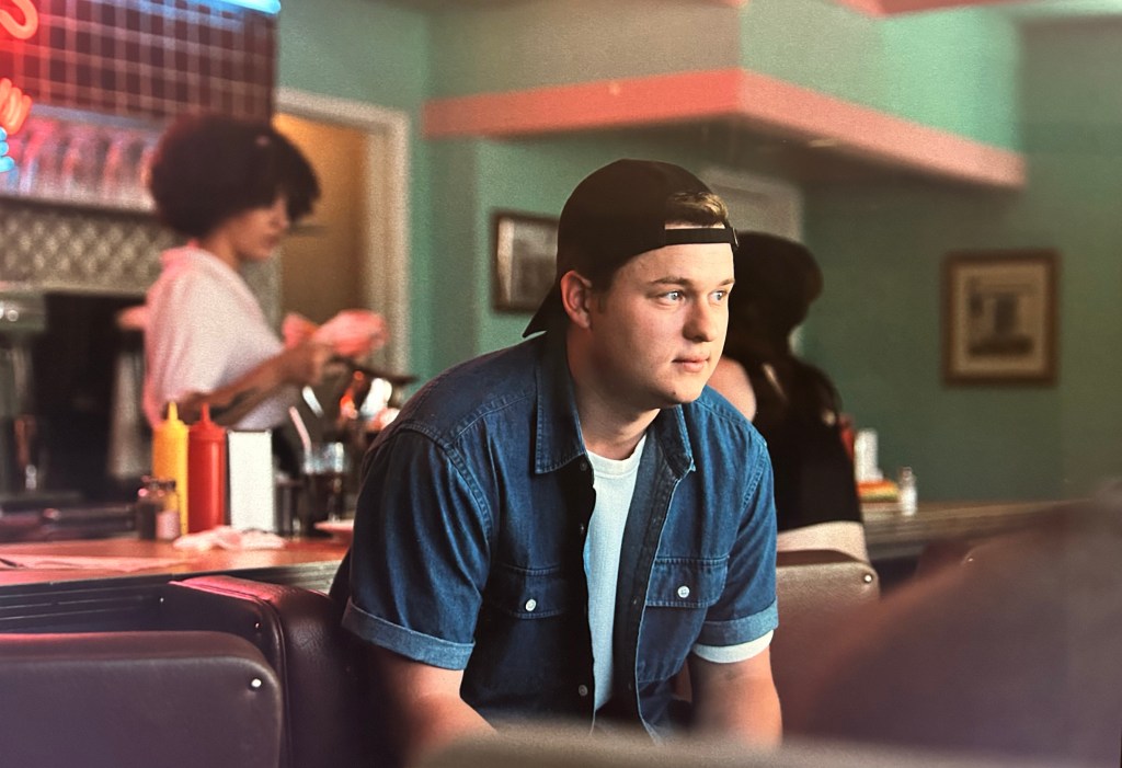
Consider the first composition of the movie, where Bear is framed in the center, but there is a window diagonally on the left of the frame, a window in the negative space behind him on the right of the frame, and a jukebox (or something?) framed within that window behind him. The composition is, I think, the aesthetic thesis of the entire film: that the action takes place in fairly standard compositions, but the space around that action is unsettling in ways that break into the foreground during the film’s most horrific moments.

Part of that unsettling nature has to do with the displacement of time. The first scene takes place in a retro diner, which is only really established with the cut to Bear’s friend, Ian. While he, in the foreground, is dressed in contemporary style (open shirt, backward cap), the soft focus behind him shows a waitress in a somewhat retro top with a tile wall and neon sign that is certainly keyed into the “timeless” vibe of diners across California. It’s complete with a milkshake with a candy-cane stripe.

This conversation also introduces the theme of “time” in its dialogue. When Bear discusses when he should ask out Nikki, his friend insists asking her out at their weekly trivia night is a bad idea. “When should I ask?” Bear asks. His friend’s reply includes: “All you have is time,” which he clarifies to mean “Wait. Do it at the right time.”

The first somewhat clear image we get of the inside of Bear’s home comes after he arrives to discover his cat, dead from apparently eating a bunch of pills. Bear’s discovery and disposal of the cat is all in dark close-up. In this shot, Bear is on the right side of the frame, backlit by a desk lamp. Above his bed are four scatter-shot posters of different sizes, and the wallpaper in his bed has vertical stripes, which both contrast from the horizontal stripes in the opening diner scene and make the bedroom look like a prison. Later that night, Nikki calls Bear and tells him she is resigning from the music store where they both work. When he asks why, she says: “I don’t know. Yeah, we’re kinda running out of time, Bear.” As she says “time,” the film cuts to a shot that is presumably from Bear’s perspective looking at a clock in the shape of a red cat ticking back and forth. Like the cut in the first diner scene, the cut to the cat clock feels anachronistic. The clock is a “Kit-Cat Klock” which, per their website dates to 1932. So, then, what is “time” in Obsession? How can Bear be told “All you have is time” while Nikki laments “We’re kinda running out of time.” There’s a tension here that the production design is already reinforcing, where the past seems to be haunting these characters who are often shown in their own shots, isolated in their own focal plane, or boxed into the corners of frames.

Bear and his friend group are all coded as being in their early 20s. They all work at a music store, which is owned by Sarah’s dad. Nikki talks about needing a new direction in her life, and Sarah is waiting to hear about her acceptances into college. Bear can only barely articulate a desire for his life (a food critic, despite no ostensible training or drive or plan), and Ian never states any sort of goal for his own life (I guess being a billionaire might count). Despite Nikki off-handedly mentioning how “busy” work is, there are hardly any customers ever shown in the store. It’s unclear what the four of them do: are they running retail, managing stock, do they offer music lessons? These characters are wandering; some with more direction than others, but all of them clearly stuck at a juncture in their lives and trying to figure out, to varying degrees of success and intentionality, where to go from here.

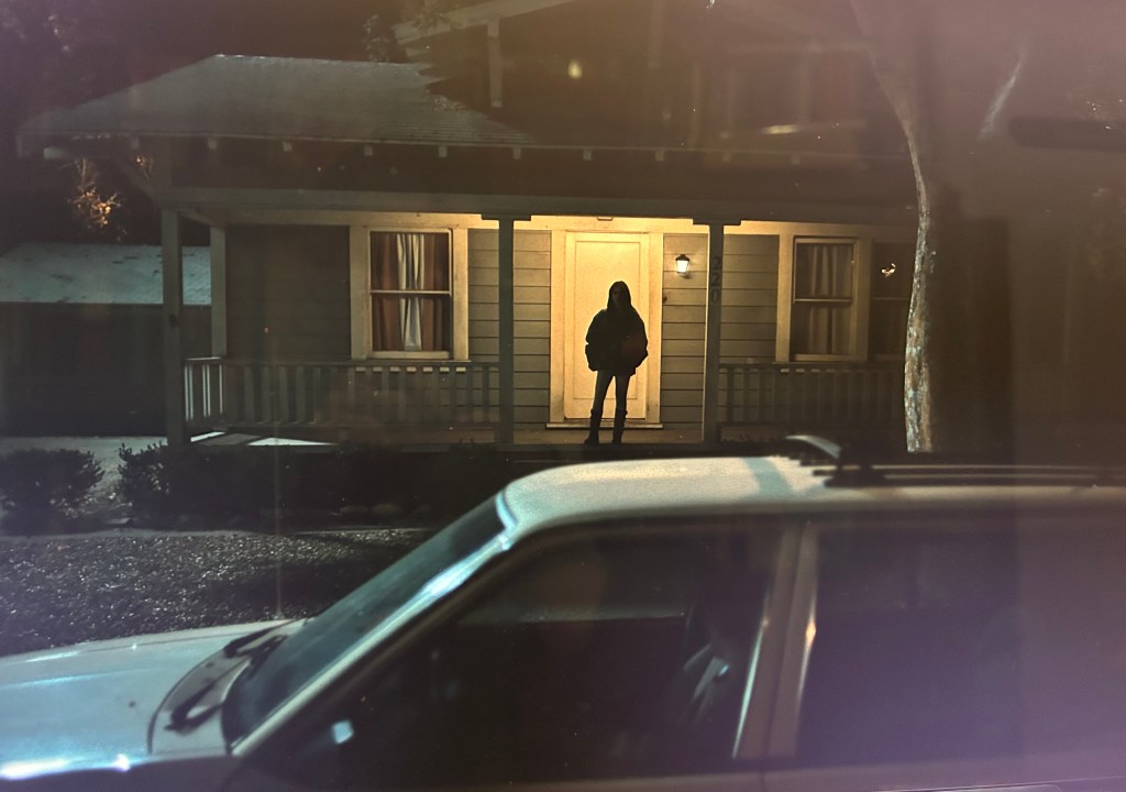
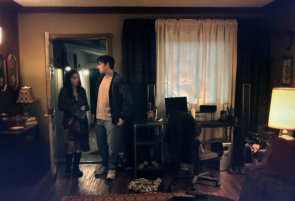
Bear’s car is similarly an old station wagon, its aesthetic clearly out of step with contemporary car trends. Its doors creak constantly throughout the movie.  When Bear takes Nikki home, the exterior of her house does not indicate whether she lives alone, and there’s no explicit moment in the movie that says if she has a roommate or lives with a family member. There is no car in the driveway and no lights on inside. A lone porch light is the only source of luminescence and sign of life in the domestic space. After Bear makes his wish and looks back at Nikki’s house, the reveal of Nikki standing on the porch has her backlit in a way that is unnatural to how the diegetic lighting appears. The one porch light would not create enough light to cast her into such an aggressive backlit appearance, suggesting there are more lights hidden up in the ceiling of the porch projecting onto the front door and creating the dynamic contrast between the light of the door and her shadowy figure. Again, space is behaving in a way that is subtly “off.” (For whatever it’s worth, this is the only time we ever see a full exterior of any character’s house in focus). When Bear and Nikki go back to Bear’s house, we seem then enter from an interior shot showing Bear open the door. The only thing visible outside are two porch lights. The design of this room speaks to the uneasy, out-of-time feeling in Bear’s house: the left side of the frame is an older aesthetic with a wooden table, a lamp, photos on the wall, and some books. The right side of the frame has a desk chair, computer monitor, speakers, and light weights. This space is torn between being stuck in a decades-old aesthetic of dark, organized wood with a smattering of different patterns, and a collection of random objects meant to connote a young man with no identifiable style or personality.

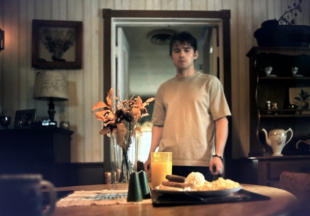
It’s here that Bear notes, “It’s Grandma’s. I got to keep it.” Death (the death of a family member) allows Bear to obtain the stability of home ownership, allowing him to access, as Nikki puts it, a “much bigger” place, but he seems incapable of doing much with this newfound stability, and it’s never established how long he’s been living here. His efforts at making it “his own” are scattered and lack any kind of discernible visual coordination, and he leaves traces of his Grandma on the walls, the refrigerator, on the surfaces of dressers, and on display chests. The appliances in the kitchen do not look like they have been updated in decades. Stacks of boxes are in the corner of his bedroom. The next morning, when Nikki serves Bear breakfast, dying flowers are centered in the composition while the chest on the right of the frame displays, among other things, a tea chest. The image on the left side of the frame hanging on the wall appears to be pressed flowers, an apt metaphor for another once-living thing trapped inside a display (perhaps like Nikki?). Dead flowers become something of a motif throughout the movie, a sign of how Nikki, in her possessed state, does not understand how to care for things and how Bear’s house is basically a space of dead and dying objects.

So even as the supernatural events that set Obsession into motion begin, these characters are all presented as being lonely and stuck. There is, I think, something to how Obsession treats these characters that is meant to reflect generational anxieties about loneliness, connection, and fears about the (im)possibility of domestic life. What the movie is doing is not operating within a kind of “postmodern aesthetic” collapsing different time periods into some form of collage for a commentary about how the past shapes the present. These elements of the design are often relegated to the background, again contributing to the “off”-ness of Obsession and compounding its dread as it moves into its second half. The past is this static thing that lingers, which speaks to a different kind of intrusive haunting.

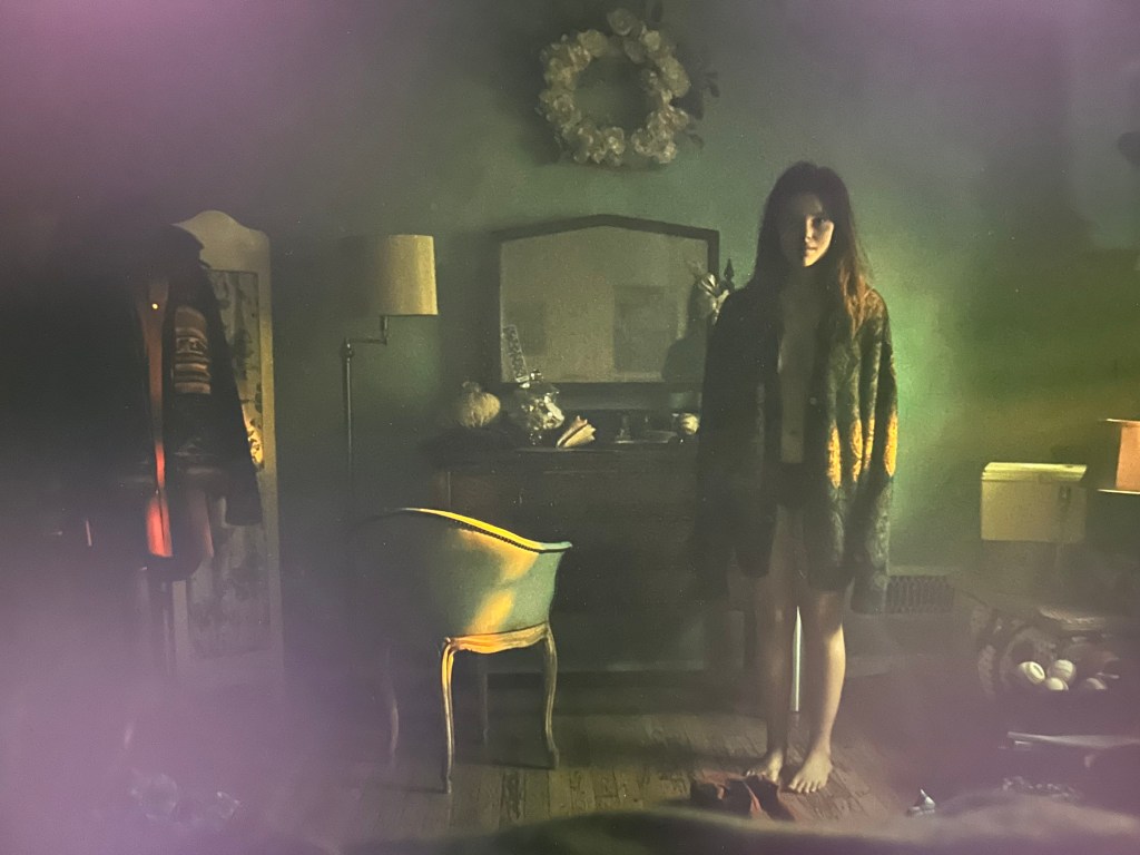
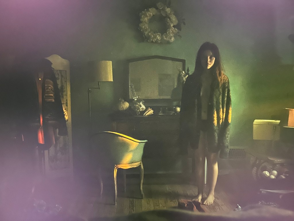
Consider the moment about halfway through the movie when Bear wakes up at 3:45 am to find Nikki watching him sleep from the corner of the bedroom. When Nikki moves from the corner to talk to Bear, she is cloaked in shadows and stands off-center. But the rest of the composition has details that show how the room is still stuck in Bear’s Grandmother’s world: the stacked hat boxes, the wreath of fake flowers, the sitting chair in front of the dresser mirror. Each of these work together in this composition to underscore how Nikki doesn’t really exist here either. The next morning, when Nikki offers Bear a packed lunch, she hands him a hardshell plastic lunchbox that looks like it’s from the 1980s or 1990s, before either of these characters were born but still heralding the way they are navigating their lives against a mess of artifacts from past decades stacked up around them.

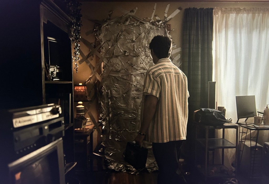
The increasing horror of Nikki’s situation is often juxtaposed against this mess of detritus. When Bear realizes Nikki has completely duct-taped shut the front door, he is framed between his desktop computer on the right side of the frame and a decades-old box TV with a VHS player on the left side of the frame. While the focus of the composition is the door—it’s almost comical while also underscoring the increasing claustrophobia of Nikki’s situation—it’s the technological artifacts framing this moment that speak back to the way these space is unnavigable even behind the supernatural violence exerting its force on Nikki. Even at work, Bear eats lunch and consoles Sarah in front of an old piano while an electric keyboard sits on top of it. Time periods constantly clashing, different eras of technology in odd juxtapositions.

So, what to make of all this? How does it point to the way they are running out of time? Increasingly, young Americans are struggling to afford homes. Nikki’s living situation is never explained. Sarah presumably lives with her dad. Bear inherits his dead grandmother’s house. Ian invites Bear to a party at “my place,” but at the party he immediately scolds a party-goer to “keep your hands off my mom’s china,” indicating Ian also still lives at home but may have co-opted a basement as a semi-apartment. There is not a lot of mobility or opportunity for these characters. This year, U.S.  affordability for homes hit a 21-year low, with median home prices rising nationally for the last three years. I think this is one of the more unacknowledged dimensions of this movie and why it seems to have resonated so much with so many people. The increasing impossibility of achieving what was once “The American Dream,” where for many having enough money to afford a down payment would require a One Wish Willow, is where the movie is actually thinking about the tensions around time. It is both the lingering elements of the past as well as the tension where these characters have ‘all the time in the world’ because they are young, while at the same time recognizing they are ‘running out of time’ to figure out how to advance in a context that offers them little room to move forward. Bear’s house feels like it has never really left, at the latest, the 1980s, like it is a portal to a dimension where affordability was even possible.

Again, what I really enjoy about Obsession is how it does not draw attention to any of these things. So much of the foreground and the center of the compositions are focused on the performances and the horror, while the edges of compositions and the production design keep enhancing the instability of these characters’ entire social context, even beyond the supernatural dressings of the plot. 

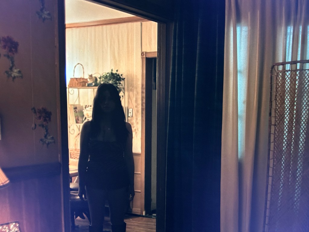
As the movie dovetails into violence in its last thirty minutes, it uses these established patterns to heighten its own tension. Take this shot of Nikki standing in the doorway. She is slightly off-center, after so many compositions put her directly center-frame. She is standing between rooms, framed by the moulding of the doorway, while the edges of another doorway appear directly to her right. The right side of the frame is filled almost entirely by a window with white light coming from an outdoor light, which contrasts to the warm yellow lights inside. This whole composition adds to Nikki’s unnerving performance because it both builds on the way the house has been framed but also violates that framing by moving her out of the center of the composition and changing how the geometry of the house has been presented through using this different camera angle and actor placement. It’s small, but it works, and it depends on the aesthetic the film has already established around the house. Even Bear’s recognition early on that he’s only in this house because he dead grandmother left it to him seems to serve as prophecy for where the movie ends: Death is the only way forward.

In a movie full of nightmares, the current economic context is almost like its own supernatural force.

What’s in a word? Apple’s “Health Sensing System” and the production of sensible bodies

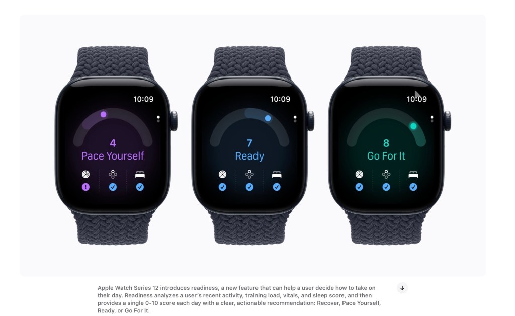
Apple Watch Series 12 interprets health data as ‘Readiness’ metrics. Screenshot from Apple.com

Recently, Apple announced its Apple Watch Series 12 device, which will come with a “Health Sensing System.” The Watch is set to go on sale today.

This new version of the Watch increases the amount of sensors on the underbelly of the device, adding more (and updated) eletrical and optical sensors. As I’m writing this, the new Watch is just becoming available to purchase, so there still aren’t really any reviews, blog posts, or social media discussions of the device ‘in the wild.’ But even before I get my hands on this Watch or am able to sift through public conversations about it, several things jumped out to me that I think are worth talking about:

In Apple’s press release, Kaiann Drance (VP of Worldwide Apple Watch Product Marketing) describes Apple Watch Series 12 as “the most advanced health and fitness companion we’ve ever created.” I can’t remember seeing Apple use the word “companion” to describe these devices much in the past (although I’m sure this is not the first time). It seems to me a highly intentional word that is meant to anthropomorphize the Watch to a degree. As a specific word, “companion” is an interesting choice, as etymologically the word’s derivation from Latin quite literally translates as “bread fellow” (com [together] + panis [bread], from the PIE root *pa- [feed]). Apple may have the later meaning of the word in mind (“a person who lives with another in need of society” as an equal rather than as a servant) as a way to sort of ‘elevate’ the device from being framed as a ‘servant’ and position it as a ‘friend,’ but the way you can trace “companion’s” etymological components down to ‘feed’ has a fascinating implication. 

If companions are formed through their ability to share food together, then what is the Apple Watch eating? I ask this rhetorically, because we all know the answer. Say it with me: your dataaaaaa.

Apple’s companionship is based on a proverbial breaking of bread where the device’s sensory array interacts with the wearer’s body repeatedly. Apple calls their revised system the “Health Sensing System.” Apple now claims to offer the “most accurate heart rate sensing in a wearable”. I know I’m parsing semantics when I say this, but note how Apple describes this as ‘heart rate sensing’ rather than ‘heart rate monitoring.’ Even Apple’s promotional materials for AirPods Pro 3 use the combined phrase “heart rate monitoring sensors.”

With the Health Sensing System, there’s a pivot from focusing solely on the functions of sensors to framing a more active process of sensing. Again, the language may offer hints of what’s going on. A “sensor” is “a device giving a signal about some physical activity” and emerged around 1947 in relation to “sensory.” Sensory has been around since the mid-1700s in its adjective form, meaning “of or pertaining to sense or sensation,” and comes from the Latin sensorius and the past participle of sentire meaning “to perceive, to feel.”

Okay, so a sensor is a device that performs some function of perception. Fair enough. A movement sensor perceives some form of motion and then engages in an action to turn on outdoor floodlights, for instance. A wearable’s sensors coordinate with algorithms and biometric data to perceive a step. But before we get into the weeds of machinic perception, let’s pause and unpack the big word, sense.

There are many definitions and connotations of sense. In the late 14th century, “sense” had a collection of meanings related to “meaning, signification, and interpretation” and, broadly, “the faculty of perception.” The word comes from the Old French sens (one of the five senses) and the Latin sensus (“perception, feeling, meaning”) from sentire (“perceive, feel, know”). “Sense” only took on the meaning of “sensible or intelligent” around 1600.As a verb, “sense” (and, by extension, “sensing”) takes hold around the end of the 1500s as a way to describe perception by the senses, which accords with the definitions above. By the 1680s, “sense” in its verb state could also mean “to be conscious inwardly of,” as in sensing a state or condition not by direct perception (a meaning which is only more visible around the 1870s).

The Online Etymology Dictionary suggests the literal meaning of sense is closer to “find one’s way” or “go mentally.” As the entry for “sense” describes, “this is from a PIE root *sent- “to go”” related to the Old High German sinnan (“to go, travel”), the German sinn (“sense, mind”), Old English sio (“way, journey”), and the Welsh hynt (“way”).

There are, clearly, lots of avenues we could go down in aesthetics, metaphysics, consciousness, and more to explore these different dimensions of sense, and that’s far more than I’m really able to tackle in a short blog post. Indeed, I toyed with going down the rabbit holes Gilles Deleuze offers in his book The Logic of Sense, where “nonsense” describes contradictions and “sense” describes correlations. (Yes, I’m writing very reductively about an extraordinarily complex book. I know.) But I think, even without treating Deleuze too deeply in this specific post, we can take this reductive understanding that sense is ‘produced’ through associations. Following on from Claire Colebrook, as quoted in Tomas Byrne’s summary of Logic of Sense: “Sense is not reducible to the ‘meanings’ of a language; sense is what allows a language to be meaningful.” Sense is always related to nonsense, and language attempts to stabilize the processes of nonsense into something that is, well, sensible.

So when an Apple Watch displays health data, it is ‘making sense’ in the ‘language’ of its numbers, graphical displays, words, etc. through the ways its sensors and algorithms are programmed to produce sense from human bodies. Pattern detection, which is something driving most algorithms designed to look for possible signs leading to blood oxygenation, atrial fibrillation, and hypertension, is about treating the human body as becoming sensible through algorithmic analysis.

If you want to read more about this sort of thing, I would gladly point you to my book, Bringers of Order: Wearable technologies and the manufacturing of everyday life (available from many fine online distributors of quality books), which has whole chapters about how wearables do this and the broader conversations around these devices. In that book, I talk about the production of “order” in much the way Apple is now talking about “sensing” here: Wearables “bring order” to life through treating everyday life as a chaos which demands particular forms of ordering; human health benefits from machine-based perception where sensor arrays (devices for perception) perform the act of sensing (processes of perception). Returning to the literal definition of “sense” as “finding one’s way,” sensing becomes an act of ordering.

Apple seems to have favored the shift to “sensing” because of the more active, continuous, and interpretive nature of its new system. Again, quoting from their press release: “HRV [heart rate variability], a key indicator of stress and recovery, is now measured up to 24 times more often and available to view in a new section of the Heart Rate app.” It measures heart rate “every five seconds, all day long,” a “new daytime vitals view lets users toggle between overnight and daytime metrics, and can potentially spot shifts in their metrics before they show up overnight,” and overnight vital measurements analyze “against a user’s personal baseline.”

These continuous, more frequent, and (as Apple argues) more precise measurements are then funneled not only into health notification features (more on that soon, hopefully, as I have some research under review that is tackling those), but into “Readiness” scores that render one’s condition in “a single 0-10 score with a clear, actionable recommendation: Recover, Pace Yourself, Ready, or Go For It.” Apple is not the first company to explore “readiness scores;” Oura has been touting the readiness scores on their Rings for years. The new “Longevity” tab in the Health app “analyzes a user’s longitudinal health data for deeper insights, including Health Age,” which can compare your ‘health age’ to your ‘actual age.’ Apple has borrowed this logic from organizations like Northwestern Mutual, Avidon Health, the Heart Foundation, and the the NHS, which all have varying ways of predicting how healthy one’s body is for their age.

There is a lot to interpret and analyze about how “Readiness” is constructed, and indeed I may do that in another blog post. If you’d like to hear more of my thoughts on the construction of Readiness, let me know in a comment!

But I think I’ve gone on enough for today, so what’s one of the big takeaways from the announcement of Apple Watch’s Health Sensing System? Up to this point, the Watch’s notification systems have been largely responsive in their interpretations, indicating to users that something about their health data suggests patterns related to, say, atrial fibrillation or hypertension. Pivoting into the language of companioship and sensing is also a pivot into predictive logics of “readiness” and “longevity.”

Sensing is a gerund, after all, and the Health Sensing System is changing the tense of how Apple discusses the everyday work of their flagship wearable device. As the device enters the market, we should continue exploring how it tries to instantiate a particular logic around machine-based perception and algorithmic analysis, and how this form of “sensing” is expanding—not just refining—the way this little “companion” breaks bread with you over the way it digests your blood.

Metaphorically speaking. There is no evidence Apple Watches are vampiric.

Hitting Yourself in the Head With a Hammer: Observations on Dumb AI Use

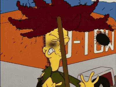
The character "Sideshow Bob" from the cartoon show The Simpsons steps on a rake, hitting him in the face

Author: James Gilmore, Associate Professor, Clemson University (jngilmo@clemson.edu)

Maybe this will be the start of a new series? One of the logics I see people who are into AI talk about it is the “tool ideology” – it’s “just a tool,” and it’s “about how humans use the tool.” Sometimes you see comparisons between hammers and other technologies — you can use a hammer as part of carpentry, or you can use it as a weapon. In technology studies, this comparison often forms classic classroom debates about human agency vs. technology design: are some technologies inherently dangerous, or do they require specific human uses to become dangerous? The answers to these questions require how we conceptualize the relationships between humans and devices, whether we understand devices to have agency themselves, and how design and implementation have their own politics.

I thought about that line — “it’s just a tool, like a hammer” — this week as I was reading a number of things about AI use in higher education. I see plenty of proselytizing AI use in my own campus, with rampant discussions about the “best ways” to include AI in teaching, research, and university operations. I’m skeptical on a good day about all of this stuff, but particularly egregious uses of AI in academic work have me thinking about the ways people can appear to be hitting themselves in the head with their own hammers. If the tool is so useful, why are you so bad at using it?

So for this edition of “Hitting Yourself in the Head with a Hammer,” I’d like to talk about peer review. In academic publishing, our work is independently reviewed by multiple experts in the field to ascertain the quality of the work, its contribution, its uses of theory and method, etc. Most manuscripts usually go through at least one round of peer review. As part of the process of responding to critiques we receive from reviewers, we are asked to compose a letter explaining the revisions we made and how they respond to reviewer concerns.

To disclose a Very Nerdy Thing about me: I love peer review letters. I love writing them for my own work, and genuinely believe the thoroughness and care with which I treat responding to reviewers is one reason I have a pretty high conversion rate from submission to publication with my manuscripts. I also love reading other people’s letters, because I see them as a window into how people think about their writing and research. They have to explain and justify their decisions, and these letters can oscillate between perfunctory explanations to more poetic elaborations. I always find them enjoyable.

I recently completed a peer review for a manuscript I had given a recommendation of “revise and resubmit.” Myself and the other reviewers found the manuscript a bit unorganized and needing more elaboration with its methods as well as to push its analysis and discussion deeper. I’m going to withhold mentioning the journal or what the article is about to protect the anonymity of the peer review process, and because it’s not important for this story.

I read the letter the author submitted explaining their changes, and found it long-winded but seemingly detailed. They appeared to respond to everything we had asked them to do, and wrote a number of paragraphs explaining the logic of their changes. Okay, great. I go to read the revised manuscript, and within a few pages something feels “off.” The things the author said they had done don’t seem to be translating to the page. They talk about clarifying concepts, providing examples, explaining theories or models, and while that stuff is technically in the revised manuscript, it’s very garbled. Over the course of maybe three pages they introduce a half dozen different concepts and theories, providing very little elaboration along the way.

By the time I finish reading their method, analysis, and discussion, I’m feeling very confused. The first version of the paper needed a lot of work, but it wasn’t bad. It had promise. This one seems more superficial, more convoluted, trying hard to say something without saying anything at all.

So I go back to the reviewer letter to see how they talk about revising the discussion of their Method, because this in particular was exceptionally weak in the revised version. And then it hits me. The whole reviewer letter has been written (or, at least, heavily edited) by an AI. For every discussion point of how they revised the manuscript, the “author” has long-winded sentences that are four or five lines long, talking in a circular verbosity that sounds superficially ‘smart’ but actually isn’t saying anything.

It’s exactly how services like ChatGPT currently produce academic writing. The tokenization process smushes together a lot of concepts at once to try and seem elaborate and complex, but the writing is actually just walking around the same very basic point. Crucially, most AI-generated academic writing I’ve read in the last year doesn’t support its claims. It just says stuff. As I read back through the reviewer letter, and then compared what the letter says the revision did to what the new version of the article says, I can’t say for sure the author used AI to revise their manuscript. They may have just fed the manuscript to their AI service along with the first version and the peer reviewer comments and asked it to write a review letter summarizing the changes.

But it demonstrated, pretty clearly, someone who thought they were using a tool to streamline the peer review process and, in the process, ended up hitting themselves in the head with their own hammer. The reviewer letter made almost no sense, and in at least two places it claimed things were in the revised manuscript that simply weren’t there.

Writing reviewer letters can feel laborious, but they are – to me, anyway – such crucial parts of the review process. They are rare opportunities for authors to speak directly to editors and their peers about their work, albeit in a more formal, anonymized form of correspondence. Why anyone would want to cede that opportunity to a machine is beyond me.

What are some examples you’ve seen recently of people hitting themselves in the head with their own hammer?

New Research: podcasting and the infrastructural politics of Google data centers

Yesterday, I had a new article published in Critical Studies in Media Communication called “‘You can actually feel the machines processing: podcasting and the infrastructural politics of Google data centers.” This article was a collaboration with my graduate student Kamila Eshalieva, who just graduated from our program and is starting another Masters degree at Arizona State University this fall.

Image of the interior of a Google data center in South Carolina. Original image located at: https://datacenters.google/locations/south-carolina/

For this article, Kamila and I performed an analysis of the first five seasons of Google’s podcast Where the Internet Lives, which is ostensibly meant to educate listeners about what data centers are and how they work, told through case studies of specific centers and testimonials from a variety of different workers. However, we used Hallinan and I’s infrastructural politics framework, which emphasizes how the formalization of infrastructures takes place alongside the construction of imaginaries around infrastructures. This podcast, in other words, builds important imaginaries that can shape the boundaries of how people might understand not just the technical operations of data centers but also their economic and social functions

However, imaginaries are also ideological and reflect the belief systems of those generating the imaginaries, so for this article we asked: How does Google’s Where the Internet Lives podcast reproduce the company’s ideologies and contribute to the infrastructural politics of data centers?

While you’ll need to access the full article to see all our results, we did find multiple themes throughout the podcast, including educative (trying to teach listeners about the data centers), sensory (trying to convey how it feels to be in a data center), ecological (how data centers interact with the environment around them), and promotional (where episodes showcase different partnerships related to data centers).

As we argue in the conclusion: “Where the Internet Lives presents itself as science communication, but its ongoing de-emphasis of communication about science and technology replaces educational concerns with a persistent ideological drum that attempts to use education as a means to shape imaginaries around media infrastructures.”

Please do give the full study a read and I hope it offers a contribution to our growing understanding of how imaginaries are built and reinforced around media infrastructures.

The Best Movies of 2025

Chase Infiniti as Willa in One Battle After Another

There’s no way to sugarcoat this: I loved a lot of the movies I was able to see from 2025. The movies on this list represent efforts at capturing the complexity of the present conjuncture, as well as representing complicated human emotions and experiences through sometimes absurd, sometimes tragic stories. They all resonated deeply with me. I hope they resonated with you, too.

10. Weapons (dir. Zach Cregger)

    The breakdown of American communal life is beneath much of the pulsing dread in Zach Cregger’s follow-up to his breakout Barbarian. Weapons uses the disappearance of (almost) an entire classroom of children as a launch point into paranoia, incivility, anger, and distrust in its first act. As it goes on and switches perspectives, it follows multiple characters who are trying to investigate and make sense of this disappearance in ways that reflect gendered and classed conceptions of community roles. By the time Weapons pivots its perspective again to become a movie more about the terrors of family itself (and, okay, yes, witchcraft), it has twisted itself into a breathless noose. While Weapons ultimately becomes a bit supernatural, its horror nevertheless reflects the increasingly absurd reality of how fractured and terrifying it feels for many of us to simply live amongst each other.

    9. Friendship (dir. Andrew DeYoung)

      As someone with often-crippling social anxiety, Friendship is quite literally one of my worst nightmares brought to life. Craig (Tim Robinson) thinks he’s finally made an adult friend in his neighbor Austin (Paul Rudd). He’s an awkward guy; Austin is cool. Austin seems to genuinely enjoy spending time with Craig, and invites him into his social circle, but Craig can’t go one night without horribly misreading a situation. A single faux pas, one miscalculation sends Craig’s life spiraling out of control. He loses his friendship with Austin, his marriage (to Kate Mara, understated but excellent) disintegrates, he has a meltdown, he loses his job. Friendship is in many ways a pair with DeYoung and Robinson’s other collaboration 2025, HBO’s The Chair Company, and they share a paranoid, slightly askew aesthetic style that mimics independent arthouse approaches to camera lenses, lighting, and framing to make your skin crawl with cringe and unease. Where The Chair Company is more about hyper-fixation, Friendship is about social cues and social dread. It feels more like a horror movie than a comedy, where the terror comes from simply existing in society. 

      8. Train Dreams (dir. Clint Bentley)

        “Hold on to something,” Robert Grainier (Joel Edgerton) is instructed to do in the final moments of Train Dreams. The act of grasping, the sensation of being thrown off-kilter as Grainier experiences a small plane ride, sends him catapulting through his memories. The entire movie runs back, distilling its sensitivities down into glances, touches, rays of sunlight, wood and leaves, smiles, and heartbreak. Up until its final moments, Train Dreams moves along briskly, quietly, showing a man who lives his life the best he can despite the immense sadness he’s had to deal with or the violence he has seen. It appears first as a love story, then a story of resiliency, and then ultimately a story of acceptance. Edgerton’s smile, his eyes closing, looking away from the sky and the clouds and the ground, is a moment of catharsis and recognition. Train Dreams is a beautifully composed movie, and many have written about how it seems rooted in Terrence Malick’s exploration of the relationships between humans and nature. I think there’s even more to it than that, although the cycles of nature and the randomness of disaster are very much at the heart of Train Dreams. It is about how we are all caught in cycles and tides and occurrences we can hardly make sense of. They disorient us, they destroy us, but the best we can do is hold on to something.

        7. The Secret Agent (dir. Kleber Mendonca Filho)

          The Secret Agent is another deeply immersive film about paranoia and survival. Its opening scene, a prolonged stop at a gas station where Armando (Wagner Moura) sees a rotting dead body and is interrogated by the police for ostensibly no reason, immediately thrusts us into a space where we’re trying to find our bearings and understand the stakes for Armando against the political context of Brazil in the 1970s. As The Secret Agent goes on, it slowly reveals more about Armando’s actual persecution and why he is trying to flee the country, as well as a rich tapestry of others in exile trying to simply keep their heads down and survive. I’m speaking in vagueries here because The Secret Agent works magnificently at slowly unspooling information while building an immersive environment for its characters, all of whom feel rich and complex even if they only have a scene or two. While all of this would make for a great political thriller, it’s the way The Secret Agent begins to integrate a consideration of the historical archive into its narrative that really builds its power. In a dramatic last-act shift that the film has teased fleetingly in its build-up, audio cassettes, newspaper clippings, and photographs become key for sorting through what happened to Armando. What kinds of stories do we tell ourselves about our families or our countries? What would it mean to be confronted with information that contradicts those stories? What is the role of historiography, or of storytelling, in excavating links to the past? The Secret Agent has haunted me in the weeks since I finally had the chance to see it. It is both a compassionate portrait of life under a dictatorship and a bracing consideration of dealing with our own histories.

          6. Hamnet (dir. Chloe Zhao)

          I want to be clear that I didn’t really want to watch Hamnet. Knowing that it’s based (spoilers, I guess? But it’s really the conceit of the film so you should know this at this point) on a historical fiction representing the death of Shakespeare’s eleven-year-old son told from the perspective of his wife Agnes, I was fully prepared for Hamnet to be Misery Porn of the tallest order, replete with shrieking and wailing and People Being Sad. Movies about grief are a tough sell for me, and I think they’re hard to get right. Too much melodrama and it can become unbearable, too much monologuing and it can feel redundant. How wrong I was about Hamnet. From its very first moments of Jessie Buckley laying in the forest, with Max Richter’s strings swelling contemplatively around her, and Lukasz Zal’s cinematography seeming to swoop in on this private space with intimate handheld work, something felt very different in Hamnet. Yes, it’s a movie about unspeakable levels of grief, but there’s also a real beauty and tenderness to how Hamnet treats its titular character, how his death is rendered, and how Agnes and Will’s different ways of processing grief lead to an unspoken, wordless (at least between the two of them) climax at the Globe as Hamlet plays onstage. If you still haven’t seen the movie I’ll say the next part as carefully as I can, but the moment where Agnes reaches out her hand is transcendent. From the way it’s edited, to the dramatic change in cinematographic composition, to how Jessie Buckley and Paul Mescal’s faces convey monologues of unspeakable emotion, and yes, to Max Richter deploying his “On the Nature of Daylight” to cap it all off, it really is Pure Cinema. It has to be seen to be felt.

            5. Sentimental Value (dir. Joachim Trier)

              Devotees may recall I’ve been a fan of Trier’s work for over a decade at this point. The Worst Person in the World is in the running for my Top 10 of the whole decade right now. I love the way Trier writes, I love the way he films scenes, the performances he is able to consistently get from his amazing actors (Renate Reinsve, my beloved), and I love the surprising ways his human dramas dialogue with more philosophical ideas about identity, time, place, history, and meaning. Sentimental Value begins with a narration about a house. That house, and the family that cycles in and out of it as they try to confront and reckon with their own pain, serves as a major character in Sentimental Value. The stories the narrator tells at the beginning become the basis for other stories the sisters speak of to younger family members and to each other. They are complicated by revelations their father shares with an American actress he has cast to play a version of his mother, a role he originally wrote for his daughter. Their father’s attempt to make one final film that ostensibly dramatizes his family’s life while using it as a gambit to reconnect with his daughter is the conflict at the center of the movie, but it is part of a variety of different strings and chords and notes about how we choose to engage with pain, with separation, how abandonment lingers and shapes and defines us in ways that are both very clear and very hard to explicate. That the film ends (not really a spoiler) on a soundstage recreation of the house, with father and daughter exchanging tentative smiles but nonetheless separated in their own shots, still at uneasy distance from one another, might signal a need to move on, or a recognition of the role of artifice, or the therapeutic nature of art, or the struggle to actually reconnect despite this earnest attempt at creating art together. One of Trier’s greatest skills as a writer and director is that his movies are about human experiences but he leaves it to us to decide what to make of it.

              4. Eddington (dir. Ari Aster)

                For me, this is the best movie about COVID-19 anyone has made so far. I know it’s a divisive, polarizing movie. I know it’s nasty, and it descends into absolute violent madness in its last 30 minutes. But Aster’s town of Eddington, its dueling police chief (Joaquin Phoenix) and mayor (Pedro Pascal), and its array of citizens young and old scrambling to derive meaning during the early months of the pandemic, captures in deeply unsettling ways how it felt to watch ideologies intensify and amplify, how it felt to watch communities crumble over masks and testing, how misinformation and disinformation warped people’s senses of reality as so many seized on COVID-19 as their own platform for gaining influence and celebrity, how well-intentioned protests might still be performed by people who are good at saying slogans but not really grappling with the words they’re saying. And, beneath that, how Eddington builds its crescendo of political violence, of corporate conspiracy, and how it doubles back on data centers as sources of resource and value extraction that are literally crippling power and authority in local communities… this isn’t just a movie, it’s an entire thesis about the rot of this whole decade. I’m not even saying I agree with all of Aster’s provocations, but his willingness to provoke and to consider how COVID-19 enabled and accelerated violent articulations between politics, technology, ideology, identity, and social life is remarkable.

                3. Sinners (dir. Ryan Coogler)

                  One of my favorite theorists and philosophers of the early twentieth century is Walter Benjamin. Benjamin writes about something he calls “the dialectical image,” a moment of shock and interruption that disrupts the flow of linear time and forces us to come into contact with what he elsewhere called “the wreckage of history.” Sinners is a monument to the wreckage of history build around one of the most extraordinary dialectical images I can remember seeing in a mainstream movie. When Sammie (Miles Caton) performs during the opening night of the Mississippi Juke Joint that serves as the setting for much of the film, entire histories of Black music swirl around him, projecting the past and the future into a beautiful harmony through which he swerves as he plays his guitar and sings. It’s an astonishing sequence, and one that becomes the pivot point of the movie: up to this point, it has focused on “Smoke” and “Stack” (both played by Michael B Jordan) building this Juke Joint for their community with money they’ve lifted from Chicago gangsters. After this point, it begins to devolve into a horrific vampire movie that focuses on its own themes of predatory extraction—of music, of bodies, of blood—that is then refracted through a final confrontation with the vampiric force of white supremacy. Sinners is a masterful movie. It’s gorgeous, it’s thrilling, and its ultimate point is about how hard it is to hold on to a truly free community when so many people would rather suck the life from you for their own gain.

                  2. Bugonia (dir. Yorgos Lanthimos)

                    Again, I’ll do my best to not spoil anything outright, because the thrilling setup for Bugonia — where the conspiracy-addled Teddy (Jesse Plemons) and his cousin (Aidan Delbis) kidnap CEO Michelle (Emma Stone) because Teddy believes she is an alien hiding as a human who has been sent to destroy the planet — barely scratches the surface of how the second half of the movie spirals out of control. All I’ll say is that the final twist of Bugonia made me make a noise somewhere between a gasp, a laugh, and a genuine “guffaw.” It’s an audacious and uproariously entertaining movie, with Stone and Plemons giving amazingly captivating performances. But apart from how genuinely exciting and thrilling I found it, Bugonia is tapping into the confluence of social, economic, and technological conditions that create people like Teddy. Its great virtue is not to treat him as a caricature—as a foolish idiot who believes everything he sees on YouTube—but as someone who has been traumatized by corporate America and by people in his community simultaneously, and who genuinely feels there is no other truth and no other path for himself. Bugonia starts with what is, at first glance, a sort of tongue-in-cheek critique of CEOs (“they’re so out of touch with the real world they’re basically aliens,” or something like that), but it morphs into what feels like an entire condemnation of our social condition.

                    1. One Battle After Another (dir. Paul Thomas Anderson)

                    Although Benicio del Toro’s “a few small beers” quip has become one of those Instantly Iconic bits from One Battle After Another, I do think his Sensei is at the heart of what this movie is about. Sensei is not only about caring for the students in his dojo like Willa (Chase Infiniti, in a performance so good and so gripping I refuse to believe it’s her first movie role), but about the immigrant communities around him that he helps to protect. When Bob (Leonardo DiCaprio) comes to him for help finding Willa and evading Steven Lockjaw (Sean Penn), Sensei doesn’t hesitate. He provides care and shelter for those who need it. He picks Bob up and drives him as far as he can. He gives him shelter as long as he can. His calm demeanor in the face of the absurdity of what’s happening around him contrasts to Bob’s manic, pot-addled inability to keep everything straight in his head and Lockjaw’s robotic sadism. As Lockjaw uses immigration raids as the pretense for stalking Bob and Willa, One Battle After Another opens up into a movie where the characters are all chasing each other but the world around them is about military violence, immigration, community, and resistance. What makes it such a masterpiece isn’t just its immense technical skill or the ways it’s dialoguing with political violence, but also the ways it expands and contracts its tension. The movie can be as big as a military raid and a street protest in its second act, and then it condenses down into a stretch of highway for its nailbiter of a climax. It’s the ways the tension itself is predicated on absurdity — the supremacist group The Christmas Adventurers worship Santa, and it’s deeply amusing, but the hitman they send to dispatch Lockjaw is also terrifying. DiCaprio’s now-famous scene of screaming on the phone about how he can’t remember revolutionary codes is very funny, but it is also about this dad’s frustration and pain and fear about finding his daughter and protecting her. That One Battle is about this father-daughter relationship at the same time as it’s about the violent condition of American society, that it ebbs and flows and expands and contracts across this spectrum so effortlessly, is what makes it so astonishing, so thrilling, such a capstone for PTA’s career thus far. But, again, for me anyway, it’s Sensei at the heart of the movie, staying calm, making sure everyone’s taken care of, offering “a few small beers,” or calmly reminding Bob to have courage, that resonates most with me. Because really, we can understand One Battle After Another as a movie where everyone is dealing with fear. Bob is terrified of losing Willa. Willa is terrified of being thrust into this situation that stems from things that happened before she was born. Lockjaw is terrified of being “found out” as potentially fathering a child with a Black woman. Fear drives them and motivates them in different ways, but it ultimately seems to rest on Willa learning to not be afraid, or at least to push past her fear, and for Bob to abandon the fears that kept him from really living for 16 years. “You know what freedom is? No fear.”

                    Culture Critically Ep 03: Crisis Communication w/ Dr. Andrew Pyle

                    In this episode, Dr. Andrew Pyle joins the pod to talk about why crisis communication research is important and the challenges it faces in the current social media ecosystem.

                    Find us on Apple Podcasts and Spotify

                    Direct link to episode: https://www.buzzsprout.com/2526001/episodes/17789562-episode-03-crisis-communication-w-dr-andrew-pyle.mp3?download=true

                    If you want to connect with Andrew, find him here: https://bsky.app/profile/aspyle.bsky.social

                    Connect with host James Gilmore at jamesngilmore.com

                    Stay connected with us at: culturecritically.wordpress.com

                    Culture Critically ep 02: “Social media research w/ Brandon Boatwright”

                    In this episode, Dr. Brandon Boatwright joins the pod to talk about why people research social media, how social media has changed over the last twenty years, and the ways social media is manipulated and manipulative.

                    Find us on Apple Podcasts or Spotify.

                    Direct link to the episode mp3: https://www.buzzsprout.com/2526001/episodes/17709151-episode-02-social-media-research-w-brandon-boatwright.mp3?download=true

                    If you want to connect with Brandon, find him here: https://www.linkedin.com/in/bcboatwright/

                    Connect with host James Gilmore at jamesngilmore.com

                    Stay connected with us at: culturecritically.wordpress.com